Package Free is the one-stop-shop for the environmentally-conscious consumer, and its visuals reflect this to a tea. Throughout its web presence, pastel and earth tones combine with a playful, spotless aesthetic—appearing to appeal perfectly to a young, affluent base whose spending habits should reflect their desire for ecological cleanliness. But is this what reusability really looks like?
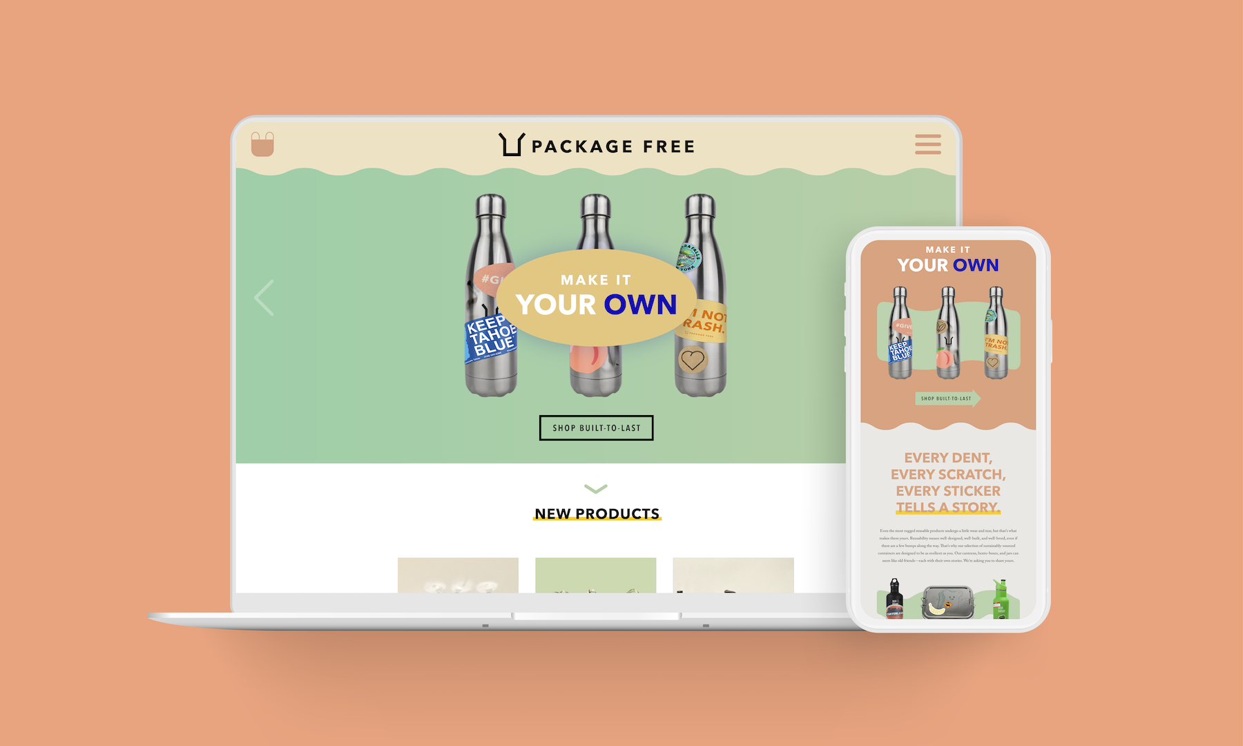
I immediately went to work taking some of Package Free’s products—containers, mostly—and beating them over the head. Well, visually. I photoshopped dents, scratches, and stickers into various product shots, rendering what I envisioned as a “built-to-last” aesthetic. That’s how I arrived at Package Free’s hypothetical “Make it Your Own” campaign: one that embraces the trials and tribulations of the reusable container on its long (hopefully infinite) journey.


Every dent, every scratch, and every sticker tells a story. So why not invite Package Free customers to share theirs? This provides an opportunity for broader engagement, while showing off products as a canvas for creativity… or just plain mishaps.


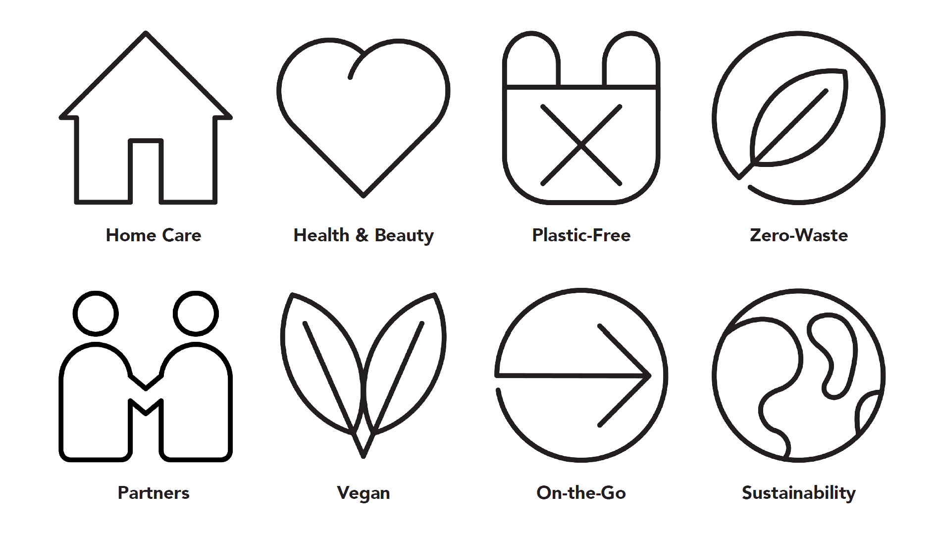
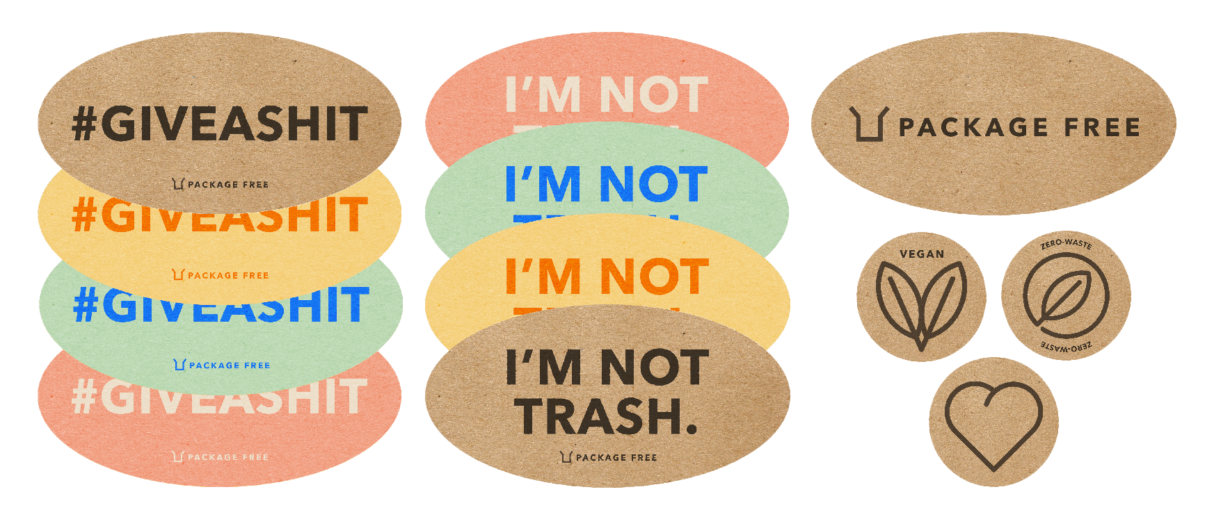
There’s even space for a brand-new product line: biodegradable stickers for further personalization. Some examples of these are included in my campaign, also designed to double as icons for web.
This brand extension is designed to strengthen relationships within the Package Free community through web and email campaigns. Make it Your Own provides a space for storytelling, reinforcing the notion that Package Free supplies reusable products as resilient and creative as its customers.
